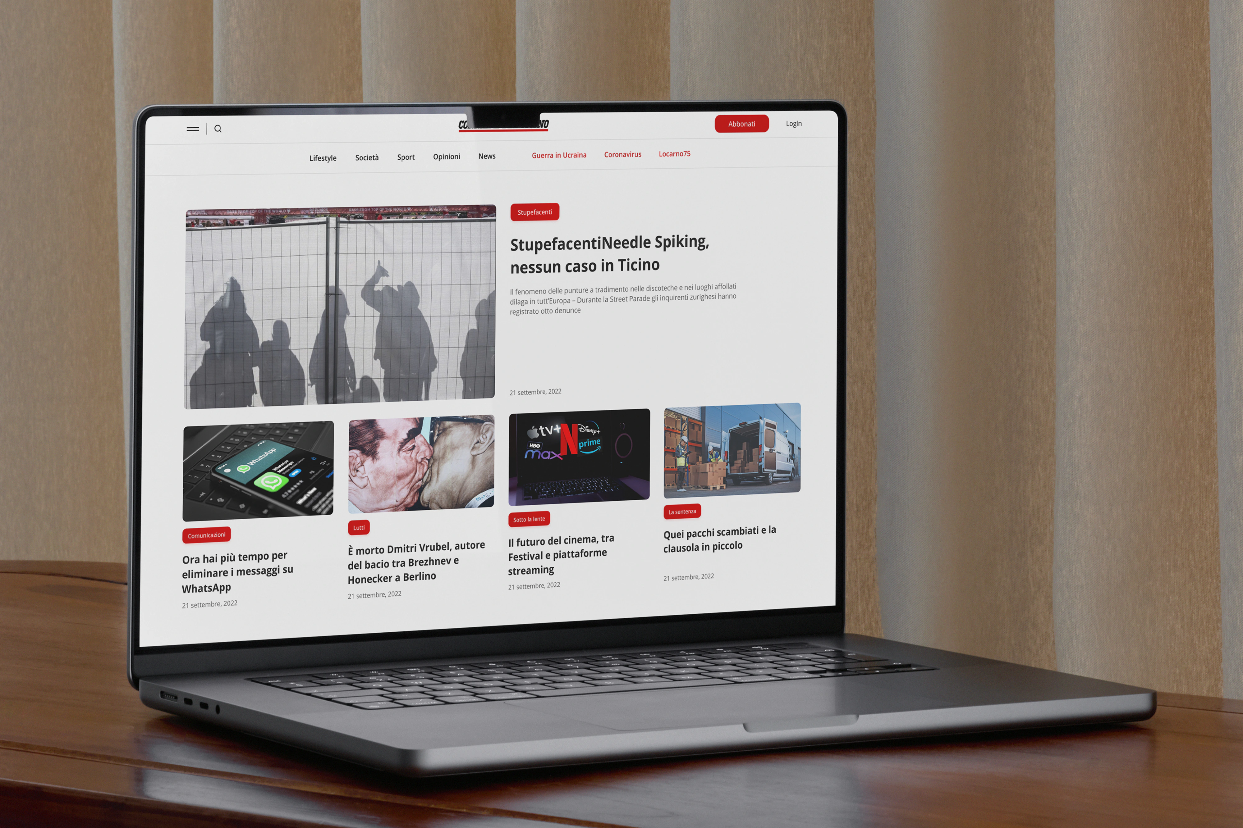
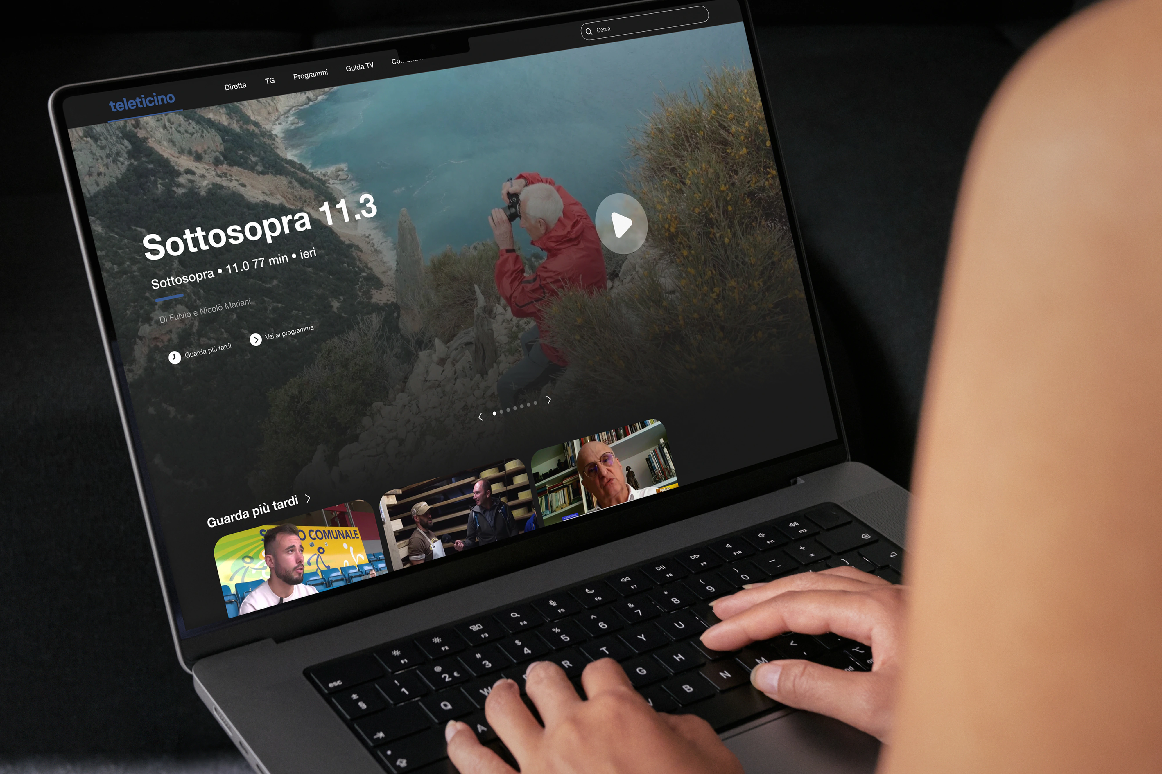
Two passes at Gruppo Corriere del Ticino: first, editorial sites that had to sound like the newsroom yet stay scannable on loud days; second, an app-shaped bet for events and dining when you’re actually planning a weekend in Ticino.
Two internships, two puzzles. First: concepts for two editorial sites (layouts and UI that carried the paper’s voice but stayed scannable when the news day spikes). Second: how to surface events and dining without tab sprawl. I watched how people browse and choose, then cut flows that felt fast and still believable for a brand readers already trust. Simone Marinelli and Manuel Antoniotti kept the work close to something you could actually build.
Font
Praho ProManualePrelo
Service
Design
Sevan Mammoli
Development
This project may include subtle visual refinements to better reflect my current standards and the way I design today.